TRCA’s logo is the most important and recognizable element of the organization’s brand identity. It is a graphic symbol that represents TRCA to the outside world and acts as an identifying and unifying mark.
The logo consists of two main elements: the icon (or favicon) and the wordmark. The three colours of the icon symbolize the three core elements we work to enhance: water and waterways, land and biodiversity, and people and communities
When using TRCA’s logo, these main elements must not be separated, moved, or adjusted in any way.
![]()
Icon/favicon – The icon or favicon is the circular, graphical part of the logo. The only time this element may appear separately from the wordmark is for certain web/social media applications such as app graphics, when using the full logo is not possible.
Wordmark – The wordmark is the text portion of the logo. It must not be used on its own. Additionally, the wordmark font, Harabara — applied to the word “Conservation” — should not be used for any other purpose.
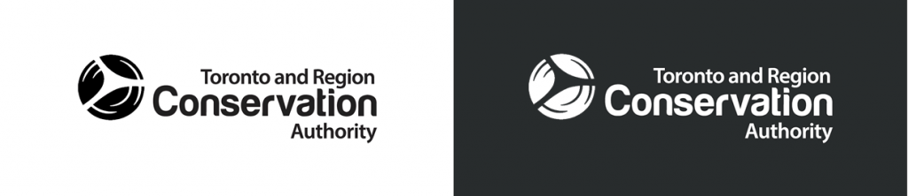
Logo colour options
To address various printing requirements and communications needs, TRCA’s logo is available in four variations: full colour, reverse colour (coloured icon with white text), solid black or solid white. No other colours, combinations, or substitutions may be made.
Full colour:
![]()
Reverse full colour:
![]()
Single colour/one colour:
For the complete set of logo specifications, please refer to the Visual Identity Guide.